Best Export Settings for Instagram in 2022: Lightroom and Photoshop Tutorial
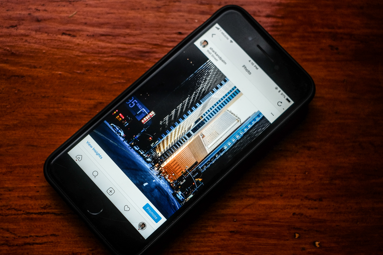
No, it's not your imagination: Instagram's upload tool can turn your gorgeous photos into grainy, desaturated, pixelated mush.
Update: This article has been updated to ensure optimum quality on Instagram in 2022. The previous version of this article was published in 2020.
Instagram has become the dominant photo sharing platform on the face of the earth. Naturally, this massive user base attracted the pro photography crowd, who funnel their massive images polished in Lightroom or Photoshop through their iPhones and over to Instagram – which, of course, is a perversion of the app's original intent.
Instagram set out to be a mobile photography sharing platform, so it makes sense that it falls apart when crunching down those massive DSLR exports. As a business, their aim is to reduce the file size on their servers so that they can store more photos for less money, and they've written an image reduction algorithm that prioritizes smaller file size over end-user image quality.
Understandable? Sure. But that doesn't make the end result any less ugly.
To avoid the algorithm, the trick is to export your photography in Lightroom or Photoshop at particular settings that reduce visual information and file size.
While the reduction algorithm that Instagram uses is propriety, photographers have managed to reverse-engineer the ideal Lightroom and Photoshop export settings for Instagram.
Here's everything – and we mean everything – you need to know.
Max Resolution for Instagram?
On Retina devices, Instagram handles images two different ways: max length on the longest side displays up to 1200px on portrait images, while max length on the longest side displays up to 1080px on landscape images. Some argue that Instagram actually renders portrait images on Retina screens at 1350px, but there are conflicting reports.
Uploading a portrait image larger than 1200px puts you at risk of getting crunched by the algorithm – so if your image is in the portrait orientation, the vertical length of the image shouldn't exceed 1200px.
Bonus tip: looking for the best “Instagram Camera” you can fit in your pocket?
Likewise, if your photo is a landscape image, the horizontal length shouldn't exceed 1080px.
In Lightroom, it's worth checking 'Don't Enlarge' on the export screen. If your image is under 1200px/1080px on the longest side, this will prevent any upscaling issues that might decrease quality.
What Ratios does Instagram Support?
On an historic day in August 2017, Instagram released an update the shook the world: no longer were users constrained to the square, 1:1 aspect ratio.
So forget those white borders. Instagram now features 4 native aspect ratios:
Square – 1:1 (max length 1200px)
Landscape – 1.91:1 (max length 1080px)
Portrait – 4:5 (max length (1200px)
Versatile – 4:3/3:4 (max length 1200px if portrait, 1080px if landscape)
The 'Versatile' aspect ratio can be used in either portrait or landscape orientation.
Most of these aspect ratios are baked in to Lightroom's crop function, but the specific 1.91:1 ratio – catering to Facebook's recommended image preview size on Facebook ads – needs to be punched in manually.
Simply click the drop down on the 'Aspect' control in Lightroom, select 'Enter Custom', and type in 1.91 and 1.
Which Color Space to Use?
You may not be familiar with color spaces, but they can make the difference between a perfect Instagram upload and a desaturated, green-tinted mess.
Color space refers to the spectrum of colors that can be represented in an image. The science goes much, much deeper than that – SLRLounge has all the details. You might have thought this stuff was only important for prints, but correctly sharing your images on the web requires a basic understanding of color spaces as well. Without diving too deep, here's what you really need to know.
When you export your image in Lightroom or Photoshop, there are a few different color spaces available. However, browsers and image sharing applications like Instagram typically display images in the default color spaces of sRGB. This means that if your image is exported in AdobeRGB or ProPhotoRGB, your photos color values will shift – ending up tinted and desaturated.
Now, the slight color difference you might see between your laptop screen and phone screen has more to do with color calibration than color space on export– and that's not something you can realistically fix. But here's what you can control: when sharing on the web – desktop or mobile – ensure your image is exported with the sRGB color space.
Now, to tie it all together...
Best Export Settings for Instagram in Lightroom
First, ensure your Crop adheres to one of the 4 native aspect ratios (1:1, 1.91:1, 4:5, 4:3/3:4)
Lightroom's Quality slider should be set at 76% – the algorithmic sweet spot between file size and image quality.
OR, you can limit File Size to 1600 kb – some say this narrowly avoids Instagram's file size compression algorithm.
Your Image Format should be JPEG.
Your Color Space should be sRGB.
Your Sharpening is up to personal taste, but we've found best results at 'High'.
Your Resolution is flexible. You can dip down to 96 ppi without noticeable degradation in image quality, but you can test this one for yourself.
If you're looking for a camera that delivers Lightroom quality JPGs and transfers wirelessly to your phone, read our review on the Fuji X100F here.
For advanced iPhone photography tips, we've got you covered.
To step up your VSCO editing game, check out this article.
Let us know how these tips worked for you. Certain images with easy-to-render elements might not need these best practices. However, other images – those with heavy gradients or text elements – might need even more tweaking and testing. Feel free to drop a line below if you're having trouble with a certain upload.


